
1. Explain what is QFD (Quality Function Deployment)?
Quality Function Deployment (QFD) is an approach to product/service design and continual improvement that brings customers into the design process. It is used to translate what the customer wants into what the organization produces. QFD requires the involvement of all functional departments of the organization at the start of, and throughout the project. This is also a primary objective of TQM. QFD requires the organization to collect and analyze inputs from customers regarding attributes they would like in a product. Some tools used in QFD include affinity diagrams and tree diagrams.QFD requires competitive benchmarking to compare customer satisfaction with the company’s current product versus competing products, and technical benchmarking comparing how the intended product will rate against that competition.
2. Explain the WHATs in a QFD matrix.
WHATs in a QFD matrix refers to the set of what the customer needs. Following are the points:
· Gathering Customer Needs Input - Have a good understanding of the potential customers’ needs in order to improve the likelihood that the product or service will be a market success. For any product category, there are a number of ways, including focus groups, user groups, polling customers of existing similar products, surveys, questionnaires, customer service inputs, warranty activity, and in any other way the organization can think of.
· Refining the Customer Needs Inputs – Assemble sufficient information on what characteristics, attributes and features customers say they need. The data must be sorted into a prioritized set of the most important customer needs.
· Using the Affinity Diagram – Affinity diagrams are used to promote creative thinking. They can be very helpful in breaking down barriers created by past failures and in getting people to give up ingrained paradigms that impede our ability to find new and different approaches.
· Using the Tree Diagram - Tree diagrams can be used for countless purposes. It will be used here simply to refine the affinity diagram results to make the list the customer needs, or WHATs that will be placed in the HOQ.
· Customer Importance- Estimate the relative importance of each listed customer need. Customer importance is usually based on a scale of 1 to 5 with 5 being the highest priority.
3. Explain the HOWs in a QFD matrix.
HOWs in a QFD matrix refers to the set of technical requirements. The Technical Requirements room of the HOQ states how the company intends to respond to each of the Customer Needs. They refer to the characteristics and features of a product that is perceived as meeting the customer needs. They are measurable in terms of satisfactory achievement. Some may be measured by weight, strength, speed, and so on. Others by a simple yes or no, for example a desired feature, appearance, test, or material is or is not incorporated. The other side of the coin is that the technical requirements must not be limiting, but must be flexible enough to allow the company to consider every creative possibility in its attempts to satisfy the need. The technical requirements are generated by the QFD team through discussion and consultation with the Customer Needs and Planning matrices used as guidance. The team may use affinity or tree diagrams to develop, sort, and rank the requirements.
4. Explain the 1, or 3, or 9 interrelationship values in a QFD matrix.
The Interrelationship matrix links the HOWs and WHATs of the HOQ. At each intersection cell of the interrelationship matrix the team must assess the degree of relationship between the WHAT and the corresponding HOW. This is usually done using scales of significance of 1 to 5 or 1 to 9, with the higher number indicating a stronger relationship. Sometimes, these numbers are entered,but often symbols are used. The idea is to estimate the interrelationship’s strength: Is it strong, medium, week, on nonexistent?
There is a rule of thumb in QFD that only about 15% of the interrelationship cells will show a relationship between WHATs and HOWs. There is, however, one firm rule with the inter-relationship matrix; every row and every column must have at least one entry. An empty column means that the HOW is not delivering value to the customer needs. “9” represents strongest relationship,”3” represents medium relationship, and “1” represents weak relationship.
5. Explain how you calculate the technical priorities in the design target matrix.
Technical priorities can be calculated by multiplying each of the interrelationship ratings of the technical requirement(0, 1, 3, or 9) from the Interrelationship matrix, times the corresponding customer need’s Overall Weighting value in the Planning matrix; and then sums the columns. All of the data for these calculations are shown in the figure below. Starting with the technical requirement for a new and responsive set of Authoring/Editing Guidelines , we find that its relationship to the customer need for a Comprehensible Text was indicated in the Interrelationship matrix as a 9. Looking across the row to the Overall Weighting column of the Planning matrix we find a value of 6.6. Multiplying them gives us a value of 59.4.
There are three more Interrelationship values for the Authors/Editors Guide technical requirement, so a total of four multiplications must be done and then summed.
For the Comprehensible Text need 9 * 6.6 = 59.4
For the Accuracy need , 9 * 9 = 81.0
For the Plausible Examples need, 9 * 5 = 45.0
For the Consistent Writing Style need, 3 * 2 = 6.0
Authors/Editors Guide Technical Priority = 191.4
The value of 191.4 is entered in the Technical Priorities row of the Technical Targets matrix under the column for the Authors/Editors Guide. The technical priorities row is completed by repeating the process for each of the other Technical Requirements.
The meaning of the resulting technical priorities numbers like 191.4 and 42.3 are translated into a percentage scale. This is done by dividing the individual technical priority values by the sum of all the priority values, and multiplying by 100.
% total priority = (Technical Requirement Priority / Sum of Technical Priorities) * 100
The rest of the % of Total Priority values are calculated, and placed in a row just below the Technical Priorities. Except for small errors for rounding, the row’s sum should equal 100.
6. Define statistical process control.
SPC(Statistical Process Control) is a statistical method of separating special-cause variation from natural variation to eliminate the special causes and to establish and maintain consistency in the process, enabling process improvement. SPC is essential worldwide today to elevate the quality of products and services, while lowering costs, to compete successfully in the world’s markets.
7. Explain control charts for variables, with a simple mathematical example.
The basic steps for developing a control chart for variables are:
· Determine sampling procedure
· Collect initial data of 100 or so individual data points in k subgroups of n measurements
· Calculate the mean (average) values of the data in each subgroup x.
· Calculate the data range for each subgroup ( R ).
· Calculate the average of the subgroup averages x. This is the process average and will be the centerline for the x -chart

· Calculate the average of the subgroup ranges R. This will be the centerline for the R -chart.
· Calculate the process upper and lower control limits,UCL and LCL respectively.
· Draw the control chart to fit the calculated values.
· Plot the data on the chart.
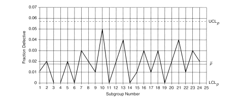
8. Explain control charts for attributes, with a simple mathematical example.
Attributes data are concerned not with measurement but with something that can be counted. the p -chart is used when the data are the fraction defective of some set of process output . It may also be shown as percentage defective. The pen makers already have gotten their defective pens down to 2% or less. If we pick it up from there, we will need several subgroup samples of data to establish the limits and process average for our chart. For attributes data, the subgroup sample size should be larger. Constructing the p -chart, we have several things to calculate: the fraction defective by subgroup ( p ), the process average ( p ), and the control limits (UCL p and LCL p ), where n=100.
· Calculate the process upper and lower control limits,UCL and LCL respectively.
· Draw the control chart to fit the calculated values.
· Plot the data on the chart.
8. Explain control charts for attributes, with a simple mathematical example.
Attributes data are concerned not with measurement but with something that can be counted. the p -chart is used when the data are the fraction defective of some set of process output . It may also be shown as percentage defective. The pen makers already have gotten their defective pens down to 2% or less. If we pick it up from there, we will need several subgroup samples of data to establish the limits and process average for our chart. For attributes data, the subgroup sample size should be larger. Constructing the p -chart, we have several things to calculate: the fraction defective by subgroup ( p ), the process average ( p ), and the control limits (UCL p and LCL p ), where n=100.
9. Explain how can we use control charts for continual quality improvement?
Control charts of all types are fundamental tools for continual improvement. They provide alerts when special causes are at work in the process, and they prompt investigation and correction. When the initial special causes have been removed and the data stay between the control limits, work can begin on process improvement. As process improvements are implemented, the control charts will either ratify the improvement or reveal that the anticipated results were not achieved. Whether the anticipated results were achieved is virtually impossible to know unless the process is under control. Each chart type is intended for special application. You must determine which best fits your need. An important thing to remember about control charts is that once they are established and the process is in statistical control, the charting does not stop. In fact, only then can the chart live up to its name, control chart .
10. Explain the way control charts could be used for quality improvements.
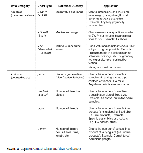
Each chart type is intended for special application. You must determine which best fits your need. the control chart is a plot of some function of process measurements against time. After the initial work of establishing limits and centerlines, plotting initial data, and eliminating any special causes that were found, we have arrived at the starting point. Data will have to be continually collected from the process in the same way they were for the initial chart. The plotting of these data must be done as they become available (in real time) so that the person managing the process will be alerted at the first sign of trouble in the process. Problems must be eliminated before the process is restarted. This is the essence of statistical process control. The common control charts are mentioned in the table below.
EXECUTIVE SUMMARIES OF SOCIAL NETWORKING ARTICLES
All Systems Ready For Navy's Communications Satellite Launch
MUOS-3 is a satellite that runs on a high-speed Internet Protocol-based system, is designed to support warfighters using an on-demand, beyond-line-of-sight capability to transmit and receive high-quality, prioritized voice and mission data. The thing which amazes me is that MUOS-3 will provide 16 times the capacity of the legacy system. Other participants in the discussion on Moodle agree with the fact this is an excellent quality leap.
The recent advancements in technology can prove to be really helpful and in a field like Navy, time and precision are very important and these attributes have been considered in the satellite’s design. This is a classical example of achieving total quality in technology.
Moodle link: http://njit2.mrooms.net/mod/forum/discuss.php?d=70969#p213849
IoT Carriers Sought by Semtech
Semtech is trying to establish the band for metro and national IoT services. They aim to offer alternatives to a jungle of proprietary technologies. The leading standards are not optimal for IoT: Cellular networks are widespread but expensive, and Bluetooth is cheap but limited in range. They using the technology rebranded as 20 Kbit/second LoRa which can stretch upto 30 miles with unobstructed line of sight.
Current applications in the market with separate networks use different protocols. Semtech wants to create a platform wherein all the applications can be run on one united platform. Semtech has currently formed alliance with small carriers and chip suppliers. Qualcomm and Huawei are the biggest competitors of Semtech at the moment, but these companies have still not moved to 900 MHz used by Semtech.
I think it is good to have competition in the market so that the final product is the best. Also, these companies are targeting to make a leap in the technological world by trying to collaborate or unify the current existing-scattered technologies. I agree with Ashish that quality partnering will certainly improve the quality of product and services for the customers.
Moodle link: http://njit2.mrooms.net/mod/forum/discuss.php?d=71414
Rapere: An Intercept Drone to Seek and Destroy Other Drones
In the article the author describes a new kind of drone that researchers are trying to develop. This product is a sort of device that has the objective to intercept and destroy other drones. They’re creating a drone called Rapere that is optimized for one single purpose: finding nearby drones and causing them to crash. Rapere is definitely not a toy and its use should be channeled in positive ways. Since Rapere doesn’t exist yet, some things are still uncertain. The cost of the product and its legal aspects are two very important concerns. These drones should definitely not be sold for private use to the public. Instead, it should be used by military, police and formal authorites only. Since the drones are aimed at destroying other drones, this is going to be hi-tech product with real-time image processing ability. This product if legally approved can be of great use for safety of the nation.
Moodle Link: http://njit2.mrooms.net/mod/forum/discuss.php?d=67603
